Show the product before the feature list
Buyers decide on proof, not promises. Why the first screen of a SaaS site should show the product doing its job, and how we build heroes that do.
- Written by
 MohammedCo-founder and CEO
- From the build
 Optro
- Topic
- Growth
- Published
- · 3 min read
The short version
- Visitors trust what they can see working more than what they read.
- Pick one real job and play it out in the hero, in three steps or fewer.
- Build the site from real product parts, so the demo and the app match.
Most SaaS homepages open the same way: a big promise, a line of supporting text, two buttons, and a screenshot too small to read. Visitors have seen that page a thousand times. They skim the promise, look for proof, and leave when they can't find it.
Our rule is simple. Show the product doing its job on the first screen, before anyone has to read a feature list. Here is how that played out on three builds.
Optro: a real review, in three steps
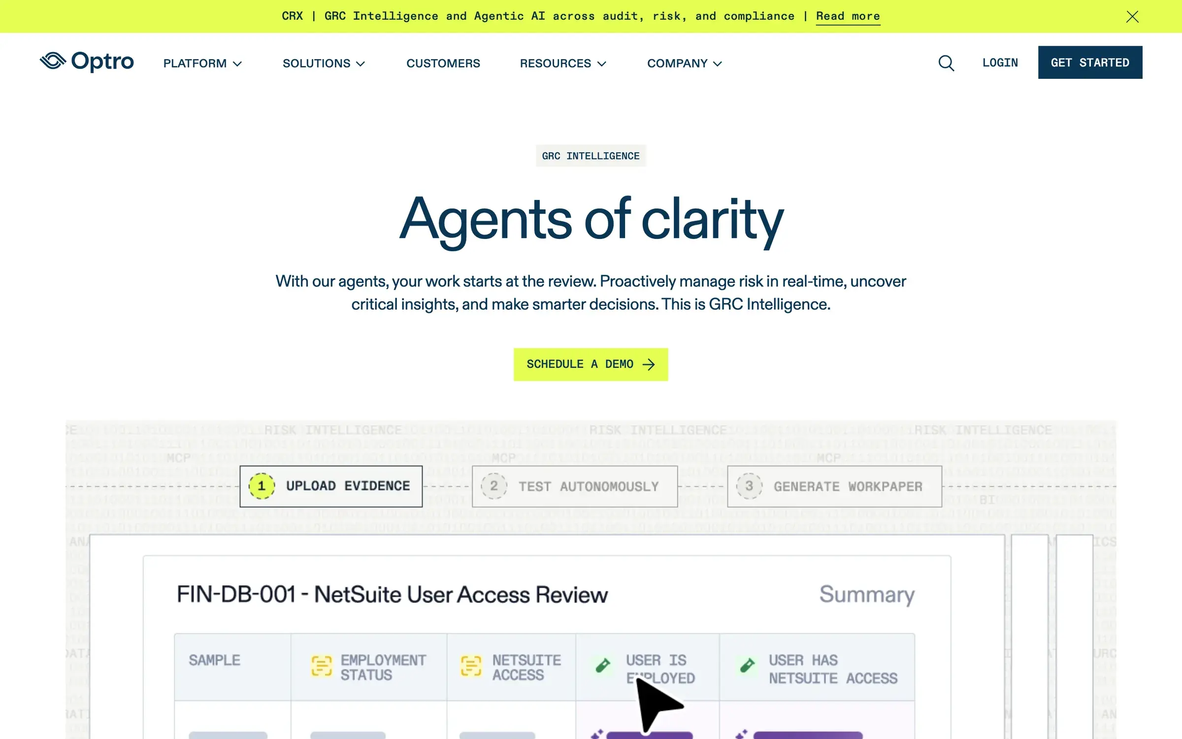
Optro, formerly AuditBoard, sells AI agents to audit and risk teams at some of the largest companies in the world. "AI for compliance" is a claim every competitor makes, so a vague promise would have vanished.
Instead, the hero plays out a real NetSuite access review in three steps: upload evidence, test autonomously, generate the workpaper. An auditor sees a task they know, done the way they would do it. They understand the product before they reach the first heading.
MindProbe: the site is built from the app
MindProbe is an AI survey platform for DTC brands and agencies. We designed the dashboard first, because that is where a buyer decides, then built the marketing site from the same parts. The charts on the homepage are the charts in the product.
That does two things. Visitors see the real product before they sign up, and nobody gets a surprise the first time they log in. After launch, the site converted more than three times better.
- 4.3%
- Site conversion rateUp from 1.2%
- 3.2x
- Lead conversion
- 92
- PageSpeed score
Fold: let people press play
Fold pays bitcoin back on everyday spending. To most people bitcoin still means trading, so the site had to make earning it feel normal. The first screen shows the Fold card held up over the dashboard, a sats counter that keeps ticking, and a demo that plays the dashboard at one tap.
The demo is opt-in. Nothing moves until the visitor asks, and the page reads perfectly if they never press it.
How to build a hero that shows the product
- Pick one job. Not the whole platform. The single task your best customer does most, start to finish.
- Script it in three steps or fewer. If it needs more, the job is too big.
- Use real screens and real data. Placeholder charts read as a placeholder product.
- Keep it readable without motion. Animation should add to the hero, never hold its content back.
- Keep it fast. A demo that costs three seconds of loading loses the people it was built for.
What to cut
What usually makes way: the abstract illustration, the row of icons with one-word benefits, and the second button. The product does a better job than all three.
If your homepage still opens on a promise, try this. Put a screenshot of the one screen your customers use most at the top, and ask five people what the product does. If they can tell you, you've found your hero. See the Optro build.
Keep reading
All notes AureloGrowth2 min read
One line of metadata hid 15 of our pages
A canonical tag in our root layout told Google that 15 pages were copies of the homepage. What happened, how we fixed it, and how to check your own Next.js site.
 QuackrGrowth2 min read
Answer the three questions people arrive with
Visitors arrive with a few questions and leave if the first screen ignores them. How we built Quackr's homepage around which country, which app and how much.