Calm sells, even in crypto
Most crypto sites look the same: dark gradients, glowing coins and jargon. Why we designed Fold and Mozaic to feel calm instead, and what that took.
- Written by
 MohammedCo-founder and CEO
- From the build
 Fold
- Topic
- Design
- Published
- · 2 min read
The short version
- When every competitor looks the same, calm stands out.
- Borrow a visual world from your product's story, not your category.
- Back every claim with real numbers, one scroll away.
Open ten crypto websites and you'll see the same page ten times: a dark background, a glowing coin, a gradient and a lot of jargon. It's meant to look like the future. To most people it looks like risk.
Two of our clients wanted the opposite. Their products are about steady, everyday money, so their sites needed to feel steady too.
Fold: bitcoin as normal as groceries
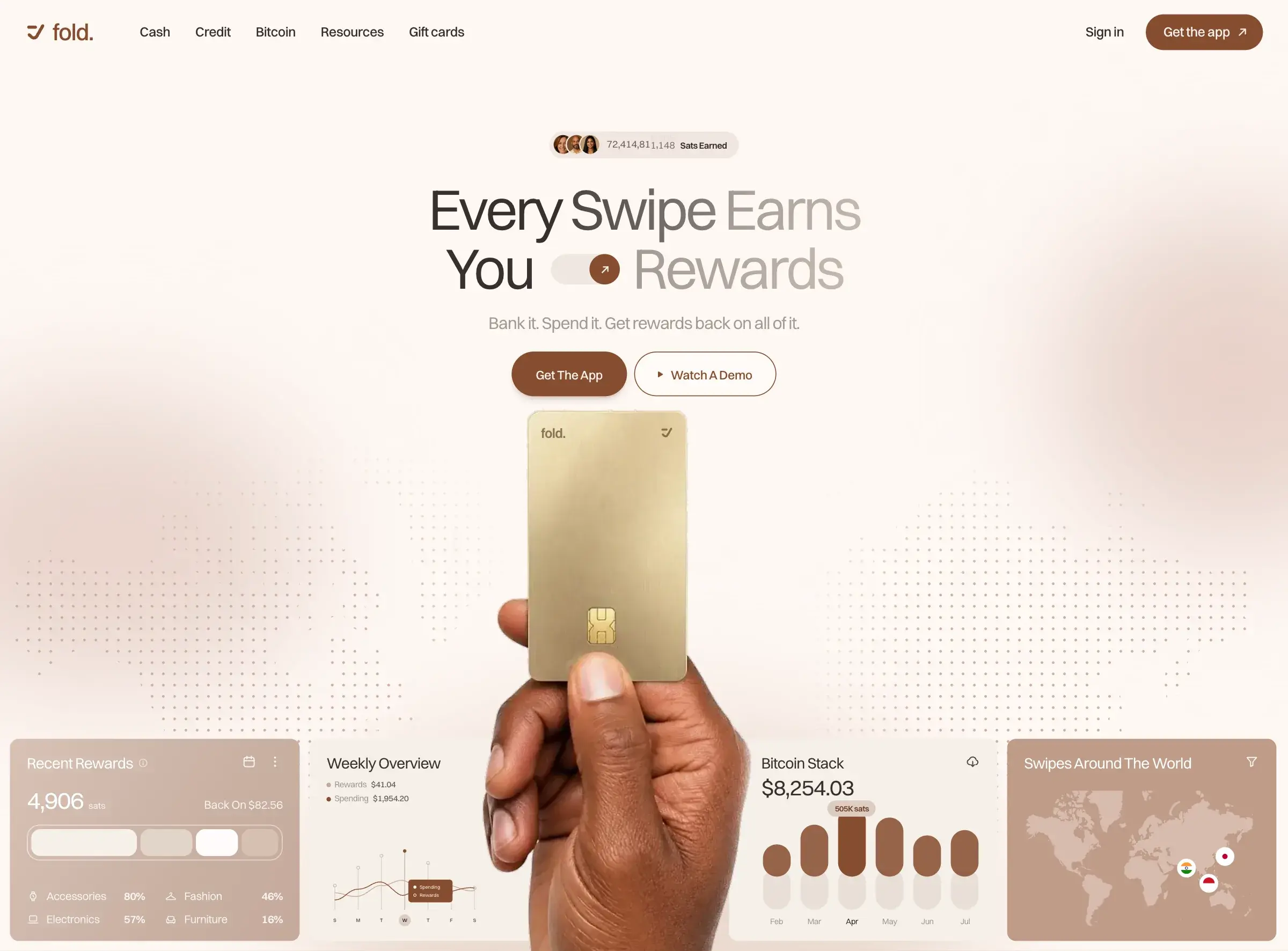
Fold pays bitcoin back on card purchases, bills, direct deposit and gift cards. To most people bitcoin still means trading, so the site had to make earning it feel as normal as buying groceries, and turn that feeling into app downloads.
Warm browns and cream replace the usual crypto neon. The first screen shows the card held in a hand over the dashboard. Nothing glows. It looks like a company you'd trust with your money, which is the point.
Calm doesn't mean vague. One scroll down, Fold's own published figures for sats earned, volume and rewards paid out count up on screen, followed by the questions people ask before they sign up.
Mozaic: an engraved world
Mozaic's AI, Archimedes, moves deposits between farms to keep yield high and fees low. The product is calm automation, so the site had to feel calm too.
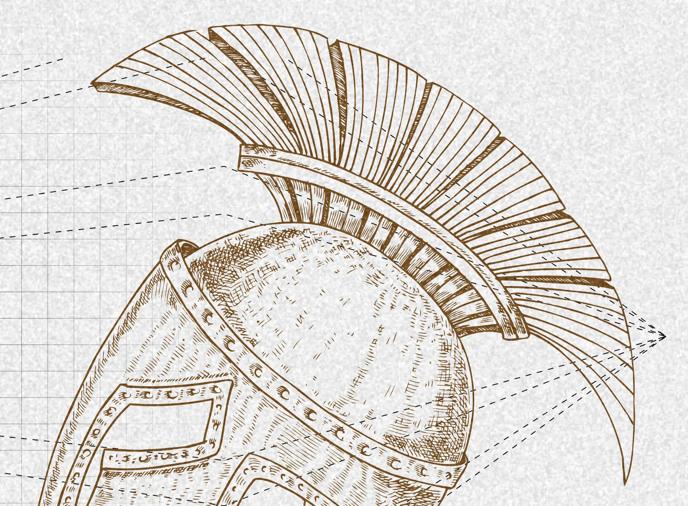
The AI is named after Archimedes, so we dressed the site in his world: hand-engraved helmets and busts on textured paper, next to big, plain statements of what the protocol does. Each section explains one mechanism in a sentence. A technical product ends up feeling human and trustworthy.
How to design against your category
- List your category's clichés. Then rule them out on purpose.
- Find a world in your own story. A name, a founder, a place, a material. Mozaic had Archimedes. Fold had everyday spending.
- Pick a quiet palette. Warm, low-contrast colours read as steady. Neon reads as speculative.
- Keep the proof close. Calm design earns attention. Real numbers keep it.
Standing out doesn't take more noise. In a loud category, the calm page is the one people remember. See the Fold build.
Keep reading
All notes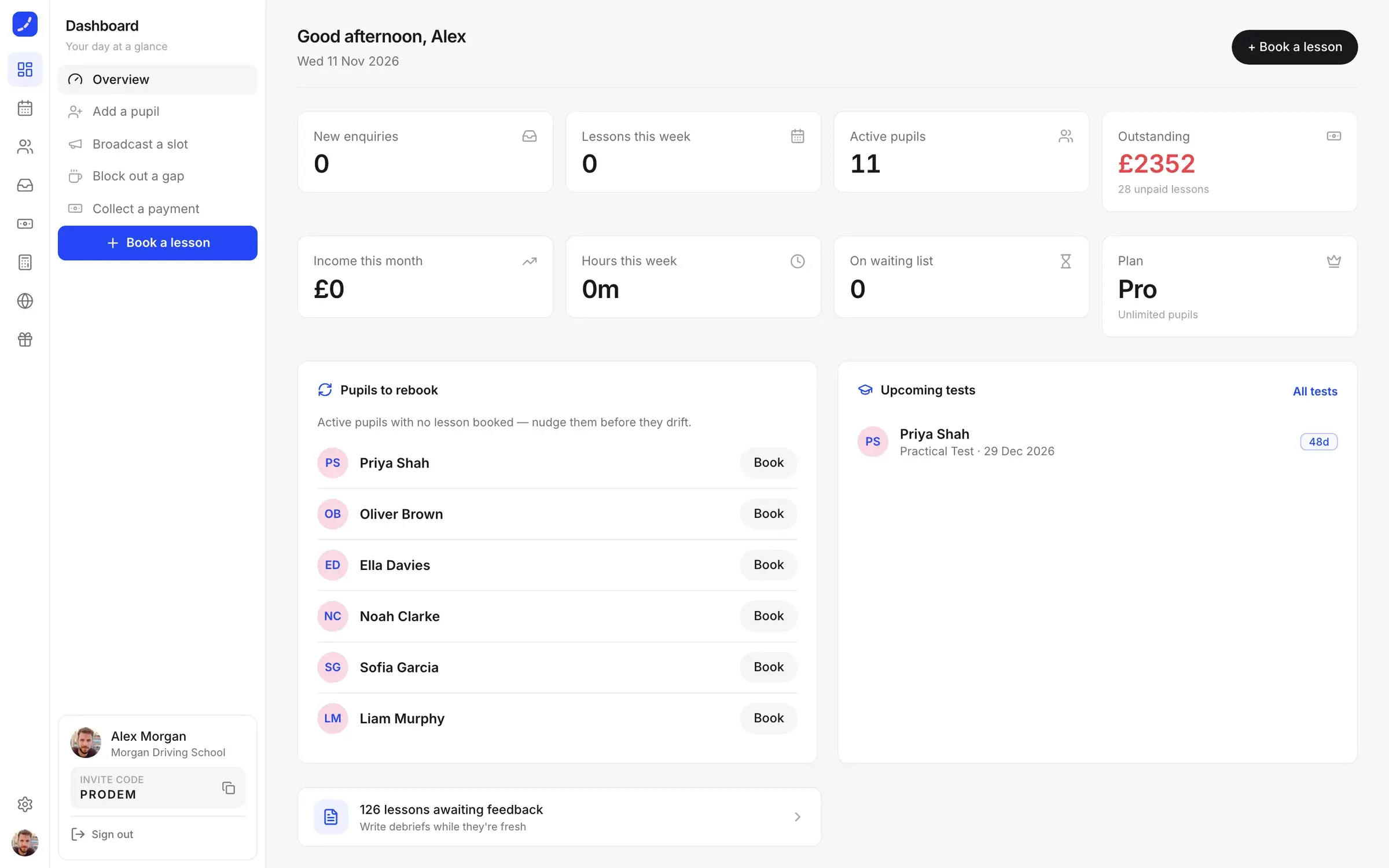
 DriiveDesign2 min read
Start with the screen where the day lives
Where you start designing a product decides what it becomes. Why we begin with the one screen people live in, from Driive, Dars and MindProbe.
 CurvanceDesign2 min read
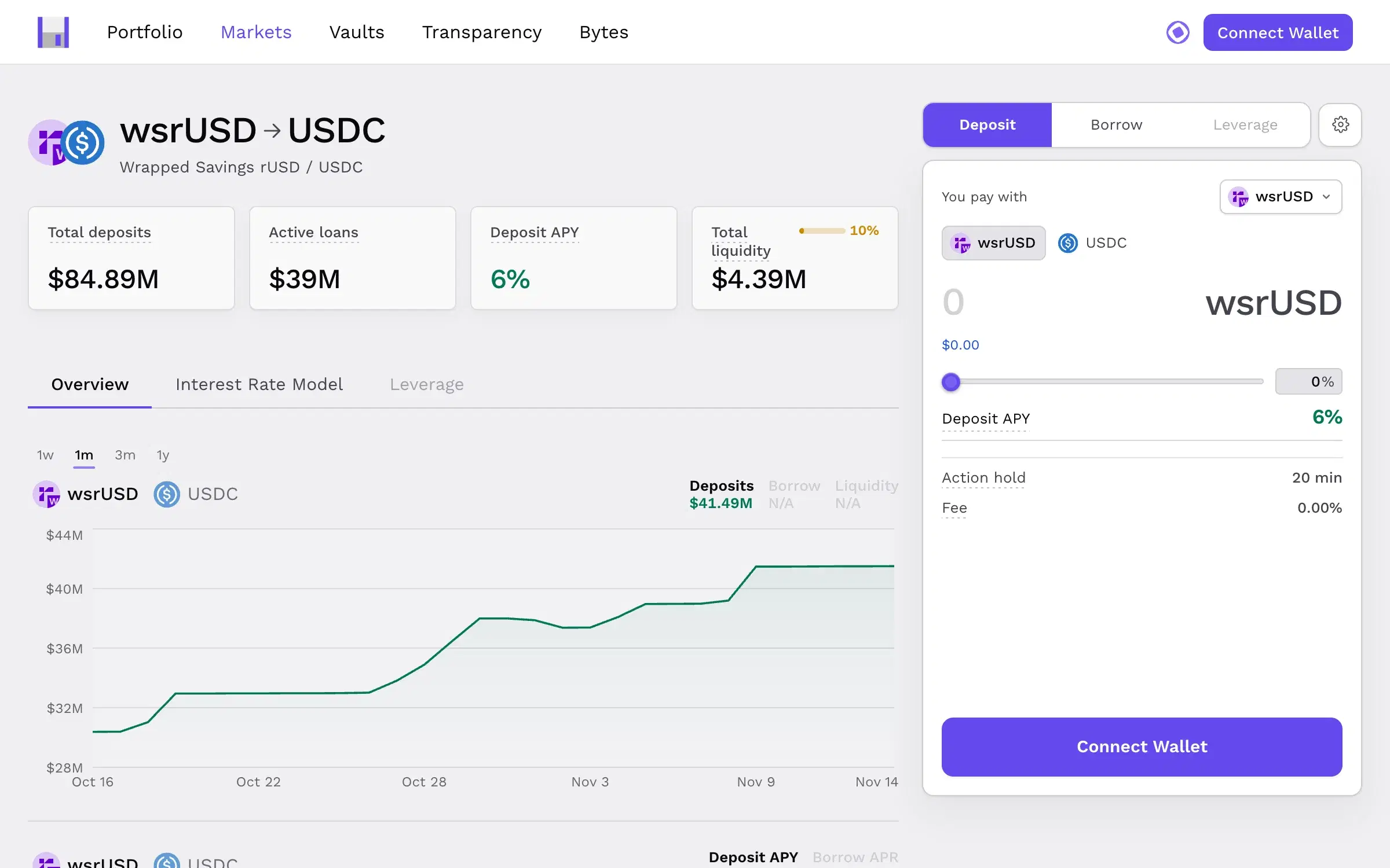
Put the risk next to the button
In products that move money, trust is won in the second before someone presses confirm. How we designed Curvance so nothing about risk is hidden.