Put the risk next to the button
In products that move money, trust is won in the second before someone presses confirm. How we designed Curvance so nothing about risk is hidden.
- Written by
 MohammedCo-founder and CEO
- From the build
 Curvance
- Topic
- Design
- Published
- · 2 min read
The short version
- Show cost, fees and risk beside the action, not on another page.
- Use one panel for related actions, so people learn it once.
- Link every trust claim to the evidence behind it.
In any product that moves money, one moment matters more than the rest: the second before someone presses confirm. If they're unsure what will happen, they leave. Or worse, they press it anyway and blame you later.
Curvance lets people deposit crypto, borrow against it and keep earning the whole time, in lending markets on Monad. In DeFi, deposit, borrow and leverage usually live in different protocols, each in another tab. Curvance wanted one app for all of it, clear enough that people see exactly what they're risking before they press a button.
One panel for every action
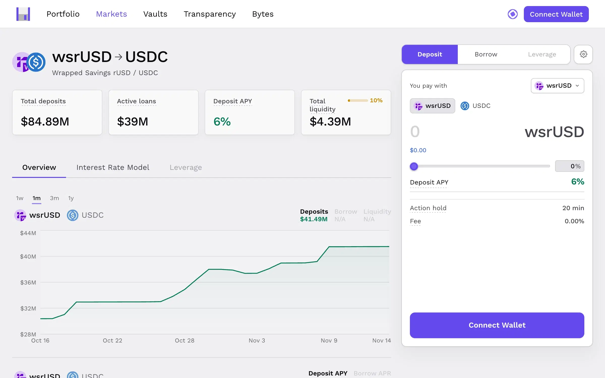
Every market opens the same way: the key numbers, a chart of how they've moved, and one panel to deposit, borrow or leverage. People learn the panel once and it works everywhere.
Before anyone confirms, the panel shows the APY, the hold time and the fee. No second screen, and no small print on another page.
Risk sits beside the button
Max LTV, liquidity and the interest rate curve sit right next to the action. These are the numbers that decide whether a position is safe, so they belong where the decision happens, not behind an info icon.
The markets table works the same way. Every market sits in one sortable table, with deposits, liquidity, max LTV and both APYs side by side, so people compare like with like.
Proof, not promises
"Secure" and "audited" are words every protocol uses. Curvance's transparency section goes further: audits, oracle checks, admin roles and incident response, each linked to the contracts behind them. A claim with a link is evidence. A claim without one is marketing.
It works outside crypto too
We used the same thinking on Interacting, a platform that pays people for real engagement on X. Creating a quest is one form with the price shown live on the right, so there are no surprises at checkout. The rules carry over to any product that takes money:
- Show the cost before the commitment. Fees, totals and what happens next, beside the button.
- Keep risky numbers in plain sight. If it changes the decision, it shouldn't live in a tooltip.
- Repeat one pattern. A single action panel used everywhere is easier to trust than five clever ones.
- Link your claims. Every trust statement should point to something people can check.
Curvance has raised $7.6M. We won't claim the interface did that, but a product that hides nothing is an easier one to back. See the Curvance build.
Keep reading
All notes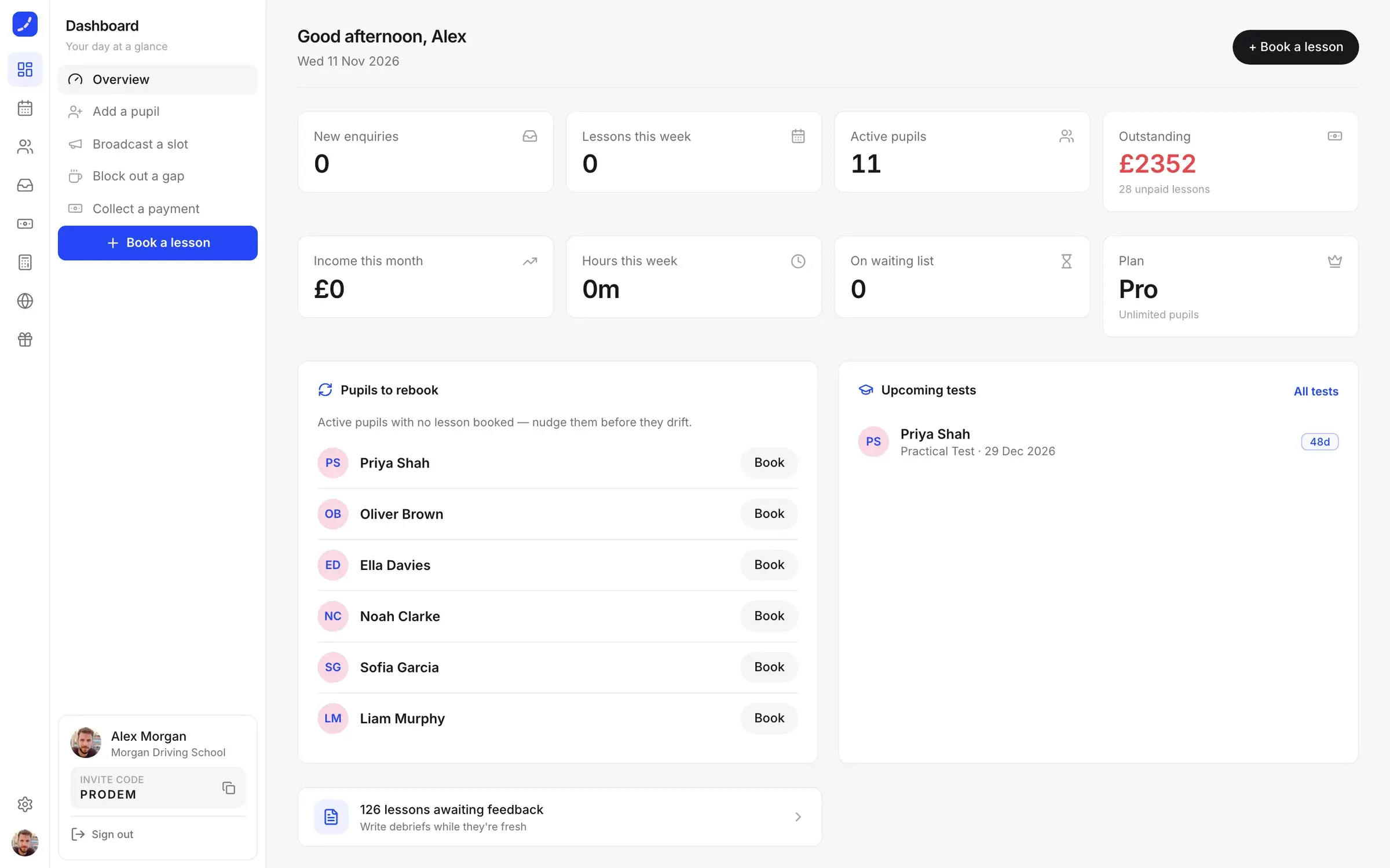
 DriiveDesign2 min read
Start with the screen where the day lives
Where you start designing a product decides what it becomes. Why we begin with the one screen people live in, from Driive, Dars and MindProbe.
 FoldDesign2 min read
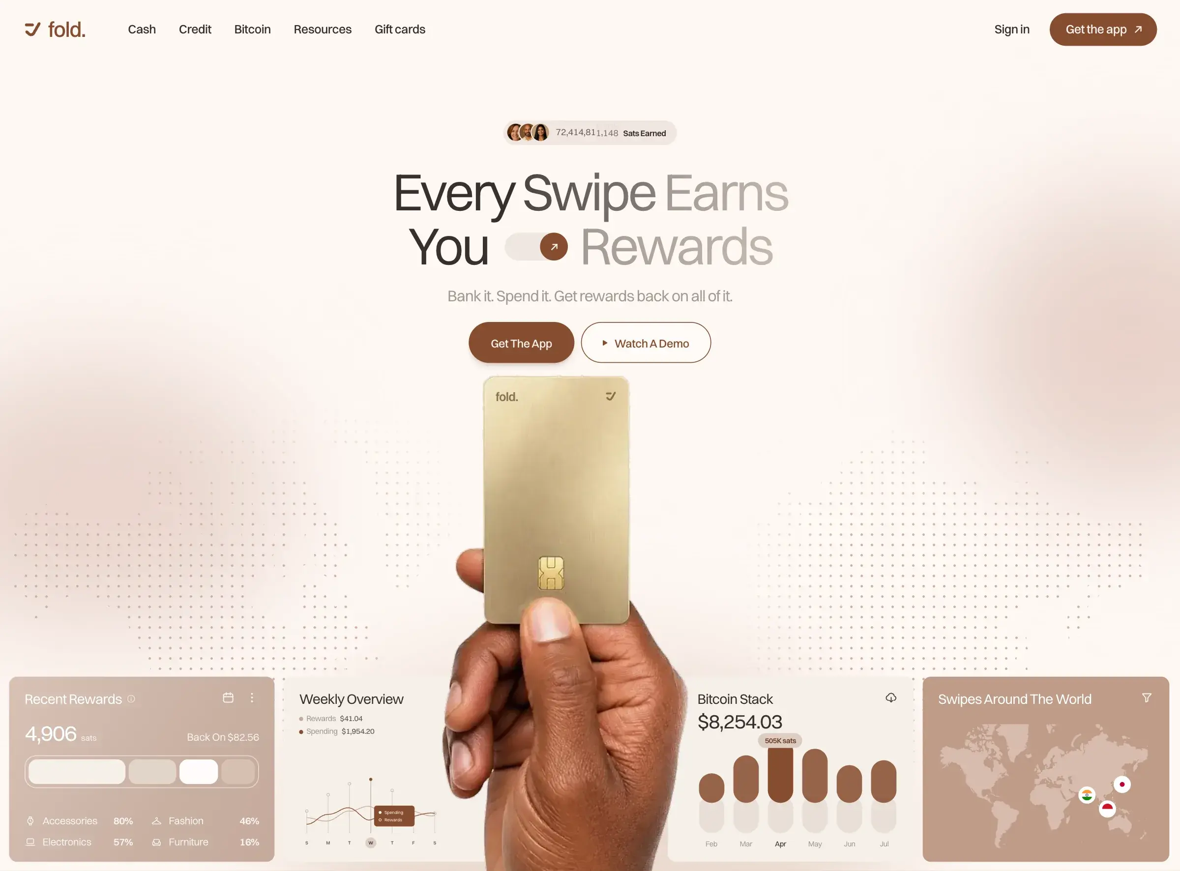
Calm sells, even in crypto
Most crypto sites look the same: dark gradients, glowing coins and jargon. Why we designed Fold and Mozaic to feel calm instead, and what that took.