Start with the screen where the day lives
Where you start designing a product decides what it becomes. Why we begin with the one screen people live in, from Driive, Dars and MindProbe.
- Written by
 MohammedCo-founder and CEO
- From the build
 Driive
- Topic
- Design
- Published
- · 2 min read
The short version
- Every product has one screen people come back to all day. Design it first.
- Let that screen set the rules for data, layout and tone.
- Features that don't make it better can wait.
The first screen you design is the one everything else bends around. Its data becomes the product's data model. Its layout becomes the pattern. Start in the wrong place and you spend months reshaping the product to fit how people actually use it.
So before we draw anything, we ask one question: which screen will people live in?
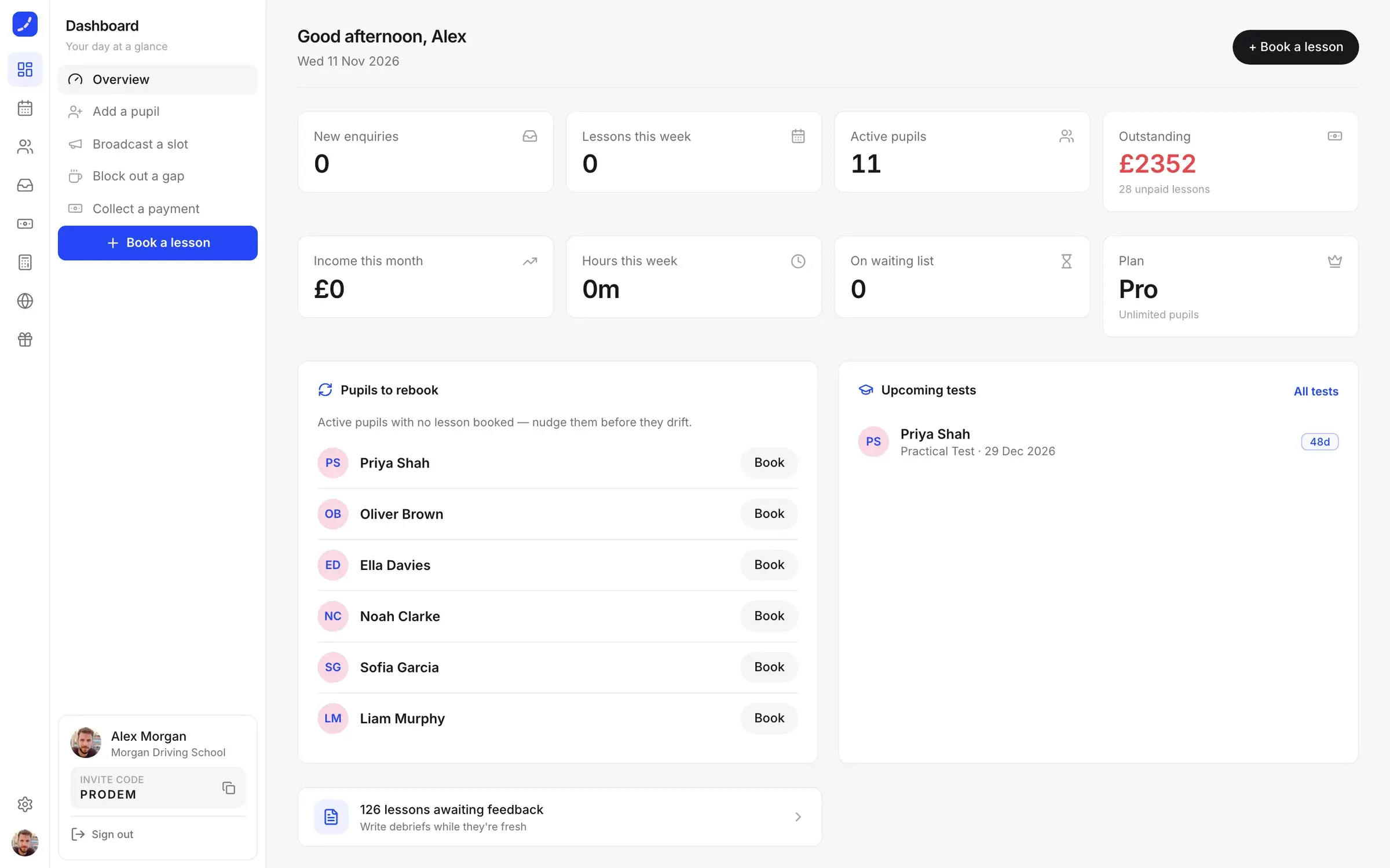
Driive: the diary
Driive is an all-in-one app for UK driving instructors. Instructors lose their evenings to admin: chasing payments, rebooking pupils, keeping a diary across texts and notes. Payments might look like the obvious place to start, since that's where the money is.
We started with the diary, because that is where an instructor's day lives. Working hours and travel time between pupils shape every booking, and free slots go straight to the waiting list. Once the diary worked, everything else had an anchor. Money sits one tap away from a lesson, with a reminder ready for anything unpaid.
Dars: the syllabus
Dars is a revision app for Alimiyyah students. Revision apps exist, but none of them know the books a madrasah actually teaches. So the first thing we designed wasn't a screen at all. It was the map: the syllabus, book by book and chapter by chapter.
Every chapter gets a summary and key points, and its cards come back on a spaced-repetition schedule, so ten minutes a day goes to what a student is about to forget. Flashcards, quizzes and study circles all hang off that map.
MindProbe: the dashboard
For MindProbe, an AI survey platform, the screen that mattered most was the dashboard, because that is where a buyer decides if the product is worth paying for. Every chart answers one question at a glance, and the marketing site reuses the same parts. The product people see before signing up is the product they get.
How to find the screen
- Watch a real day. Ask a user to talk you through yesterday. The screen they mention most is your candidate.
- Follow the habit. The right screen is the one people open without being reminded.
- Check the data. If most of your tables exist to feed one view, that view is the centre.
What it changes
Starting from the daily screen keeps a product honest. Features have to earn their place by making that screen better, and the rest can wait for version two. It's easier to sell, too: "it runs your diary" beats a list of twelve features. See the Driive build.
Keep reading
All notes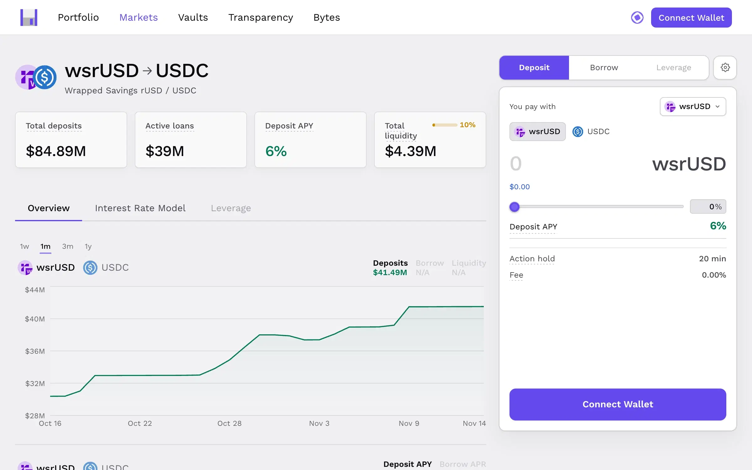
 CurvanceDesign2 min read
Put the risk next to the button
In products that move money, trust is won in the second before someone presses confirm. How we designed Curvance so nothing about risk is hidden.
 FoldDesign2 min read
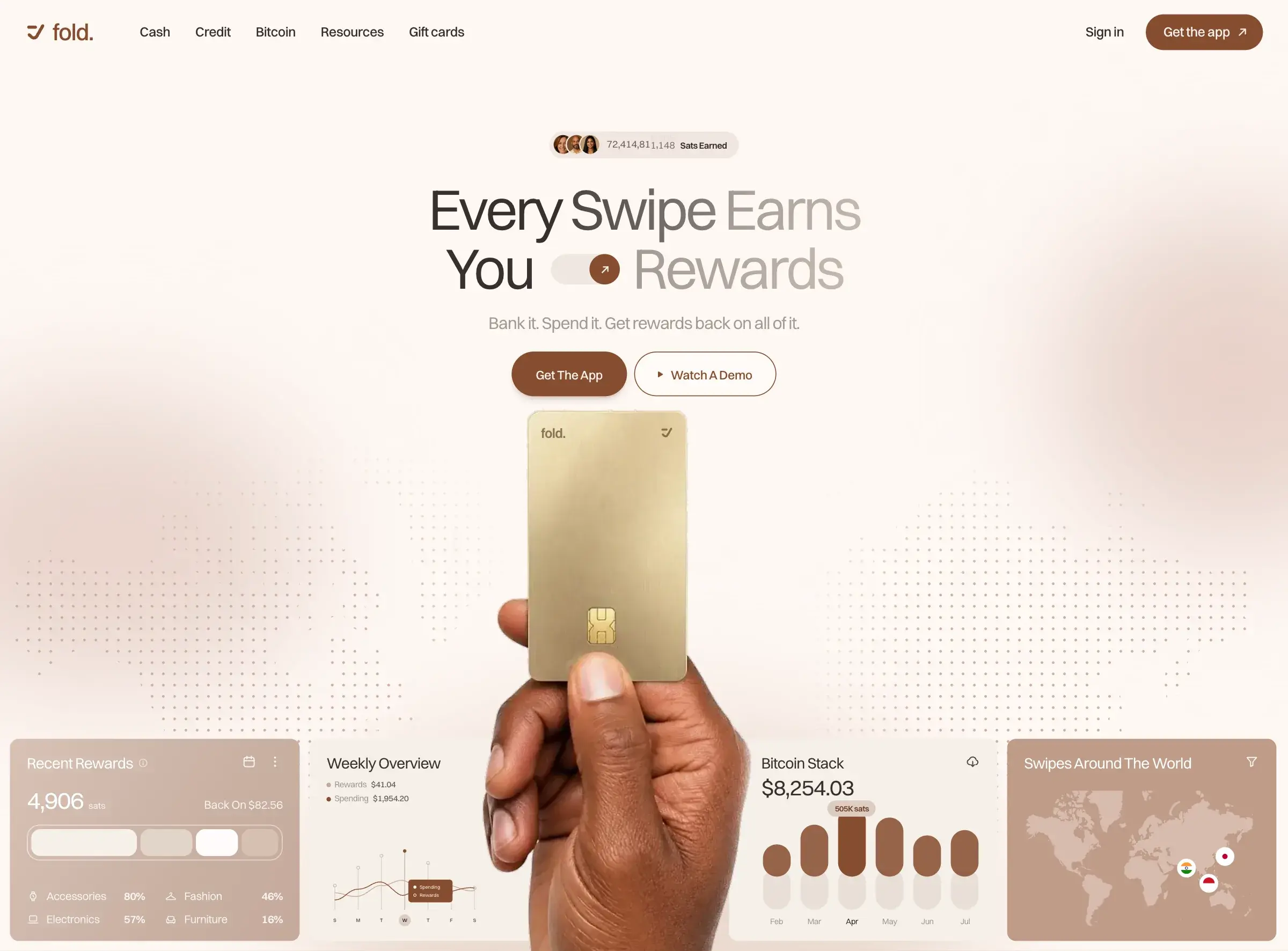
Calm sells, even in crypto
Most crypto sites look the same: dark gradients, glowing coins and jargon. Why we designed Fold and Mozaic to feel calm instead, and what that took.