Right to left, done properly
Arabic interfaces need more than a mirrored layout. What we learned building Dars, a revision app with Arabic set right to left and its harakat intact.
- Written by
 MohammedCo-founder and CEO
- From the build
 Dars
- Topic
- Development
- Published
- · 2 min read
The short version
- Set direction per block of text, so Arabic and English can share a screen.
- Use logical CSS properties, so layouts flip without duplicate styles.
- Give Arabic the line height it needs to keep its harakat.
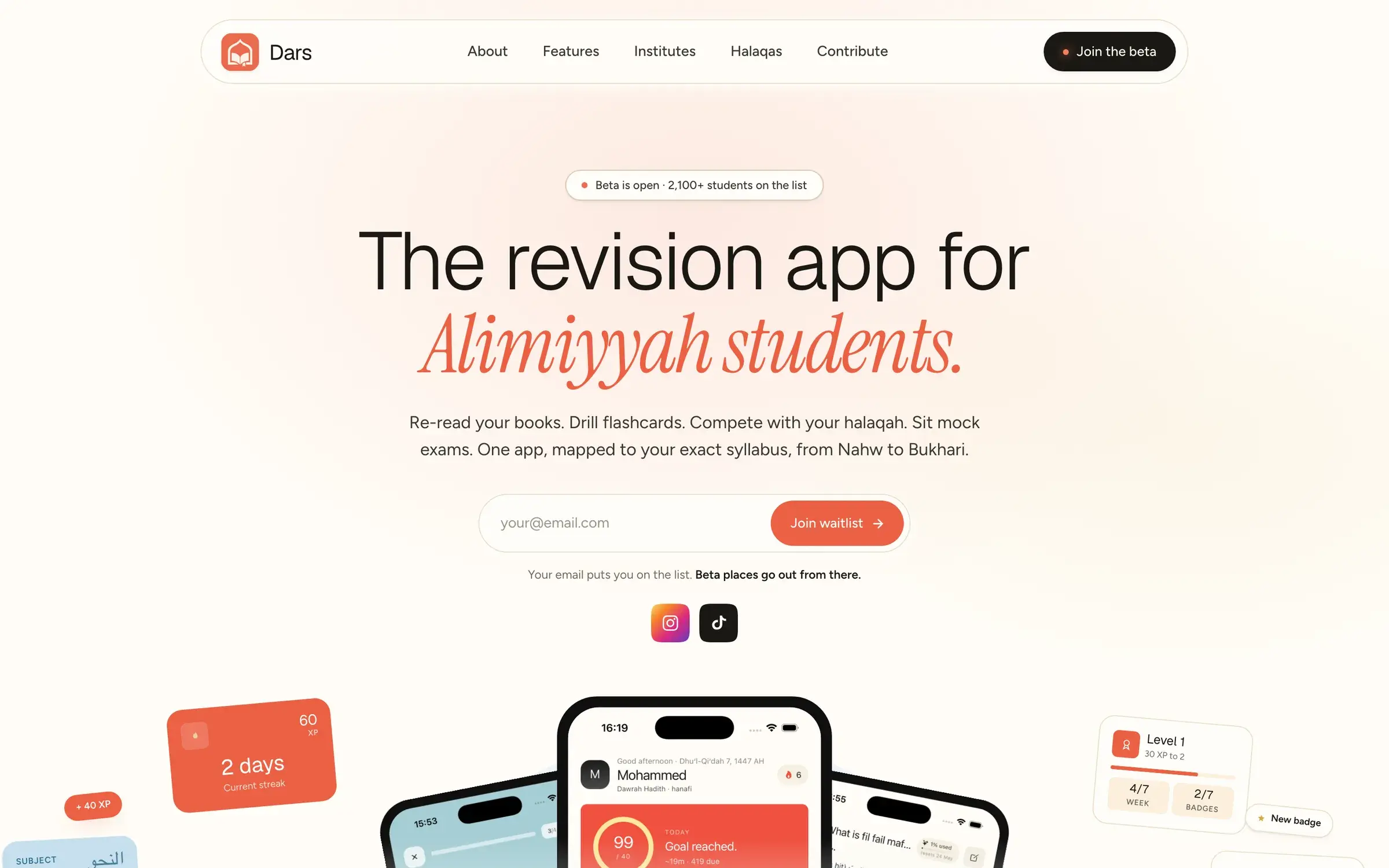
Dars helps Alimiyyah students revise the books they actually study, mapped to their syllabus from Nahw to Bukhari. Much of what they revise is Arabic, often fully vowelled, with harakat above and below the letters. Get that wrong and the app is useless to the people it's for. Its waitlist has passed 2,100 students, so there was a lot riding on it.
Building it taught us that right-to-left support is more than flipping the layout. This is what we now do on every Arabic or mixed-language product.
Set direction on the text, not just the page
Most screens in Dars mix languages: an English explanation beside an Arabic passage, or an Arabic chapter title inside an English menu. One dir="rtl" on the page can't handle that.
We set lang and dir on each block of text, and use dir="auto" on anything a person types. Each passage flows the right way, and punctuation lands on the right side.
<h2 lang="en">Chapter summary</h2><p lang="ar" dir="rtl">ٱلْحَمْدُ لِلَّٰهِ</p><input name="answer" dir="auto" />Use logical properties
Margins and padding written as left and right break the moment a layout flips. Logical properties describe the start and end of a line instead, so the same styles work in both directions.
- margin-inline-start, not margin-left
- padding-inline-end, not padding-right
- text-align: start, not text-align: left
- inset-inline-start, not left
Icons need the same thought. Arrows that mean next or back should flip. Icons that show real objects, like a play button or a clock, should not.
Give harakat room
Harakat sit above and below the letters, so fully vowelled Arabic needs more line height than English. At a line height that suits English, marks from one line can touch the next.
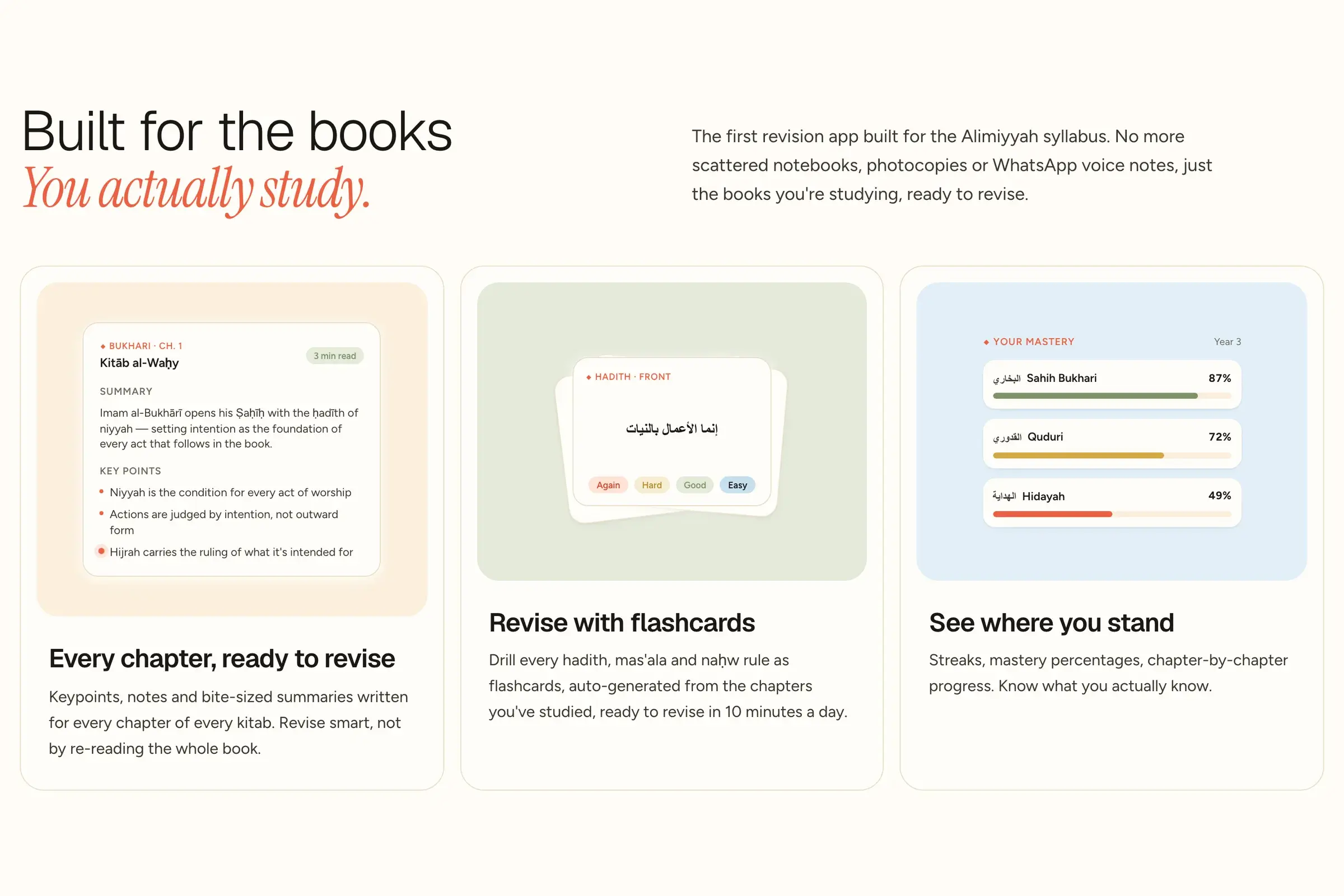
We give Arabic blocks their own line height and pick fonts that place harakat cleanly at small sizes. Then we test with real passages from the syllabus, never placeholder text, because placeholder Arabic rarely carries full vowels.
Test with the people who read it
The last check is human. Students and teachers spot what no linter will: a mark in the wrong place, a word broken across a line, a phrase that reads wrongly in context. Dars was tested by students before launch. One of them summed it up: "Revision used to be boring, but now it feels fun."
The checklist
- Set lang and dir on every block of text in another language.
- Use dir="auto" on inputs.
- Write layouts with logical properties.
- Flip directional icons only.
- Give Arabic its own line height, and test with fully vowelled text.
Keep reading
All notes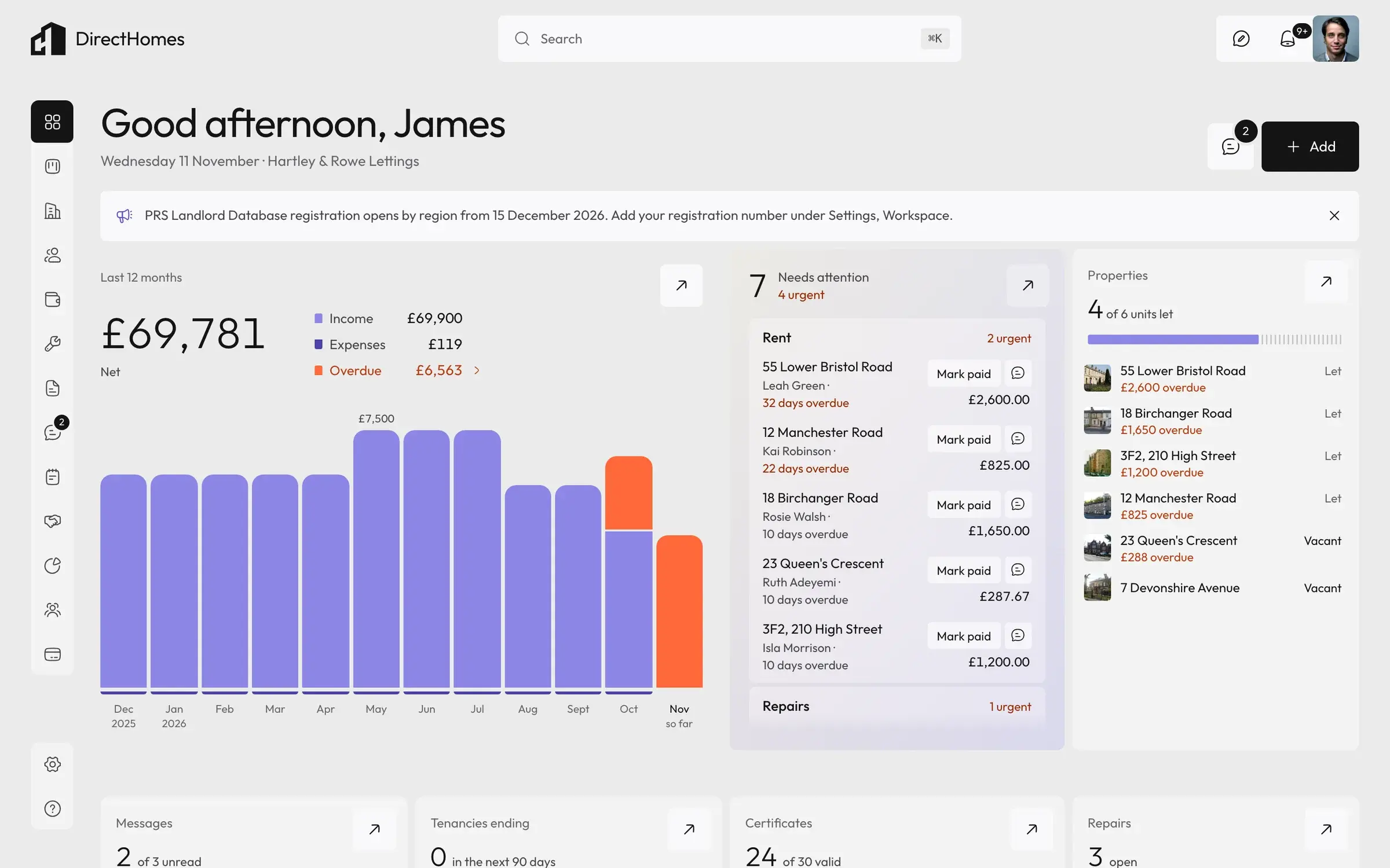
 DirectHomesDevelopment2 min read
Rebuild or patch? Four questions we ask first
When a SaaS product outgrows its first version, patching feels cheaper. Four questions that tell you when it isn't, from our DirectHomes rebuild.
 PortsmouthDevelopment2 min read
Build the admin, so you're not the admin
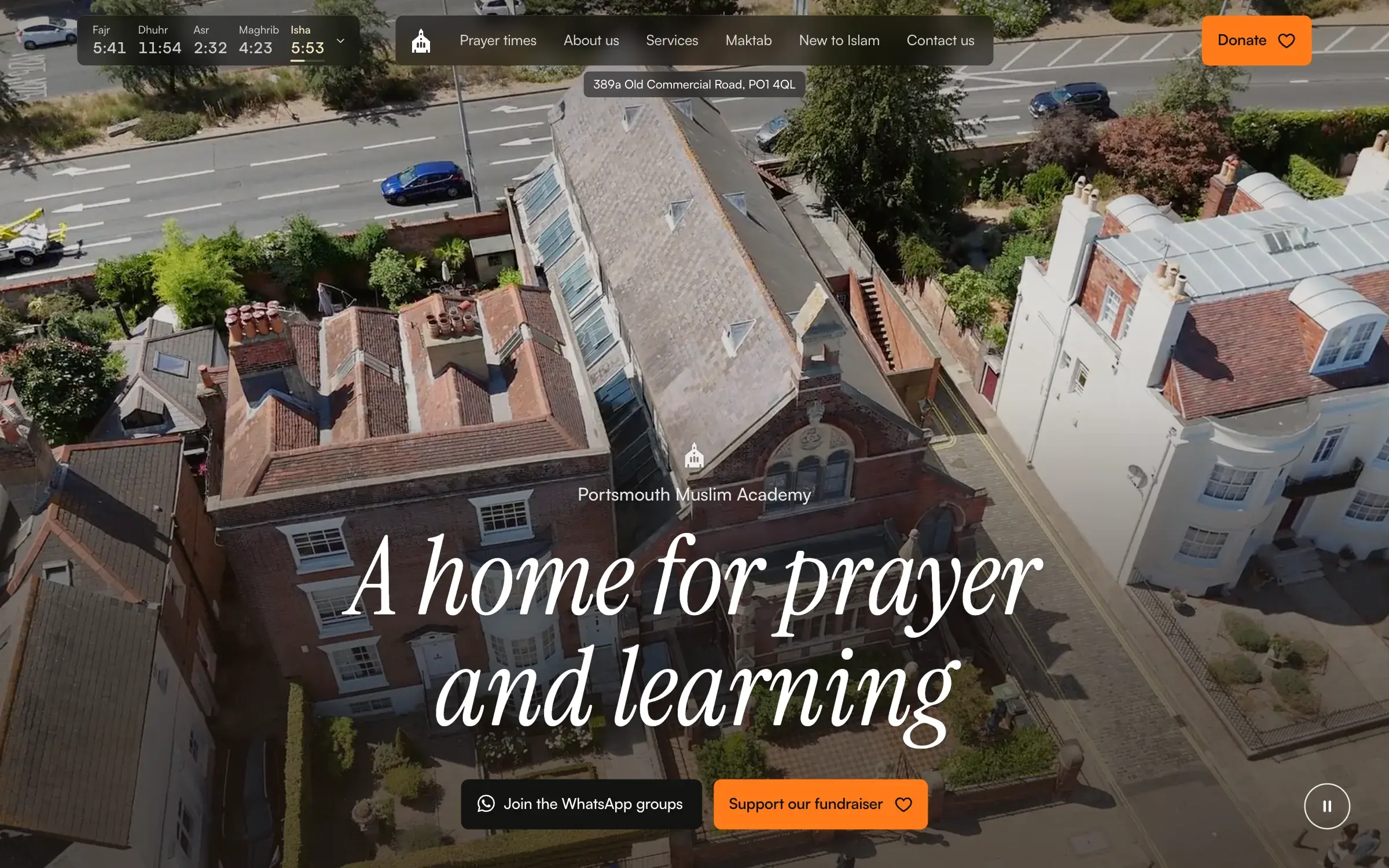
If a client has to email you to change a number on their site, the site isn't finished. How we design admin pages for the people who'll actually use them.